
Every profession has its folklore. In logo design, it shows up as "rules" that get repeated in briefs, classrooms and design reviews until nobody questions them: a logo must have a symbol, it must look modern, it must be refreshed every few years.
Most of these ideas are true for some brands and wrong for many others. The problem isn't the advice itself. It's one small word in front of it: every.
Argentine design theorist Norberto Chaves made this point years ago in a short, sharp essay on the "mythology" of brand design. His argument still holds, so here is our take on it, with what we've seen in 15+ years of designing logos for businesses, nonprofits and Jewish organizations.
Why Logo Myths Stick Around
Rules feel safe. A checklist is easier to defend in a meeting than a judgment call, and a trend is easier to sell than a strategy. But a logo isn't a template exercise. It's a decision about how a specific organization should be recognized, by specific people, in specific places. Copying a rule skips that decision.
The 12 Logo Design Myths
1. Every logo must show what the company does
A bakery doesn't need a croissant in its logo, and a law firm doesn't need scales. Sometimes a literal reference helps people place you quickly. More often it boxes the brand in, looks like everyone else in the category, and ages badly when the business grows beyond its first product.
2. Every logo needs a symbol
Some brands live on their wordmark alone, and adding an icon would only add noise. Others genuinely need a symbol: for an app icon, a social avatar, a sign seen from far away. And for some it's optional. Whether you need one depends on where the logo will appear, not on a rule.
3. Every logo must be completely original and break the codes
Being distinctive matters, but some categories have visual codes for good reasons. When we designed the identity for Del Sol Abogados, a law firm in Queens, the goal was trust and seriousness. A refined, almost classic approach was the right call. Breaking the codes would have made them look less credible, not more memorable.
4. The lettering always has to be customized
Tweaking letters, joining characters or distorting a typeface can give a wordmark personality. It can also hurt legibility and make the logo look forced. A well-chosen typeface, carefully spaced, is sometimes the strongest option. Customization is a tool, not a requirement.
5. Every logo should feel friendly and casual
Warm and approachable works for a coffee brand or a kids' program. It doesn't work for every bank, hospital or institution. A logo should match the real personality of the organization, and for some that personality is formal, discreet or authoritative.
6. Every logo must look modern
"Modern" today covers dozens of styles, so the word alone says little. Some brands should look contemporary; others gain credibility by looking established, classic or even deliberately retro. The question isn't "is it modern?" but "does it fit who they are and how long they plan to be around?"
7. A good logo follows the latest design trends
Trends are built to expire. A short-lived event or a seasonal campaign can borrow from them. A brand that plans to last decades shouldn't tie its main mark to a look that will feel dated in two years. When a big brand redesigns, like Instagram's new wordmark, the interesting question isn't whether it's trendy, but whether it will still work in ten years.
8. Every logo needs a refresh every few years
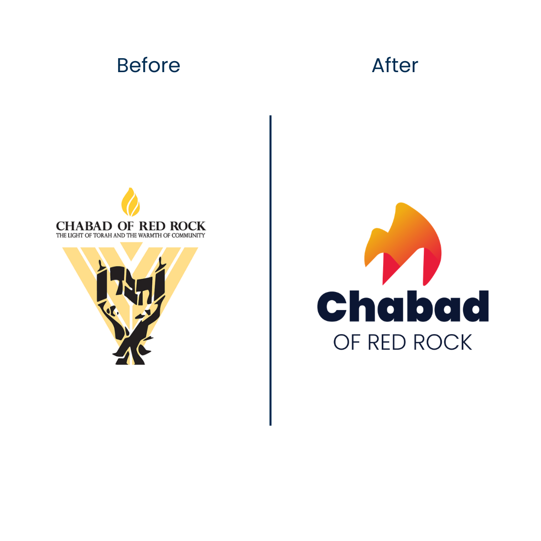
A redesign has a cost: recognition built over years gets reset. It makes sense when there's a real problem. That was the case with Chabad of Red Rock: their logo was overly complex and hard to recognize, so a new identity solved something concrete. "It's been five years" is not a reason on its own.
9. Every logo should be dynamic and change shape
Flexible identities are useful when an organization runs many activities that need their own voice. For Wornick JDS, the capital campaign Reconstructing Our Future got its own campaign identity, connected to the school but distinct from it. For most brands, though, a stable logo used consistently does far more than one that keeps changing.
10. A logo should reflect the audience's taste
A logo represents the organization, not the customer's personal style. What should appeal to the audience is the offer: the product, the service, the experience. A brand that reshapes its mark around what it thinks people like ends up looking generic, and stops looking like itself.
11. A logo has to sell
Advertising sells. A logo identifies. In a few impulse-purchase categories, a logo can carry some persuasive weight on a shelf. In most cases its job is quieter: to be recognized, remembered and trusted over time. Asking a logo to do the work of a campaign usually makes it worse at both.
12. Every logo must be ultra-simple and loud
Simplicity and impact matter when the logo has to be read fast: on a highway sign, a phone screen, a jersey. In other contexts, like a cultural institution, a publication or a premium product, a more detailed or quiet mark can be exactly right. Simple is a quality to measure against the use, not a universal law.
The Real Rule: It Depends on the Brand
None of these twelve ideas is wrong all the time. What makes them myths is the claim that they apply to every logo. Good logo design starts from the specific organization: who it is, who it talks to, where its mark will live, and how long it needs to last. That's why we start every identity project with questions, not with rules, and why we document the decisions afterwards in a set of basic brand guidelines.
Frequently Asked Questions About Logo Design Rules
Does every logo need a symbol?
No. Many strong brands use only a wordmark. A symbol is useful when the logo has to work in small or square spaces, like app icons and social profiles, or when the name is long. Decide based on where the logo will be used.
How often should a logo be redesigned?
Only when there's a real reason: the logo is hard to read or reproduce, it no longer represents the organization, or it's losing ground to competitors. Redesigning on a fixed schedule throws away recognition you've already built.
Should a logo follow current design trends?
Only if the brand is meant to be short-lived, like an event or a seasonal campaign. A long-term brand is better served by a mark that will still look right in ten years.
Is there a universal rule for good logo design?
Not a fixed one. A good logo fits the specific organization, its audience and the places it will appear. What works for a tech startup can be wrong for a law firm or a synagogue.
Planning a new logo or wondering if yours needs a redesign? We'll tell you honestly whether it does. Let's talk.
This article is inspired by Norberto Chaves' essay on the "mythology" of brand design. Source: "Every Logo Should Be…" on ForoAlfa.


